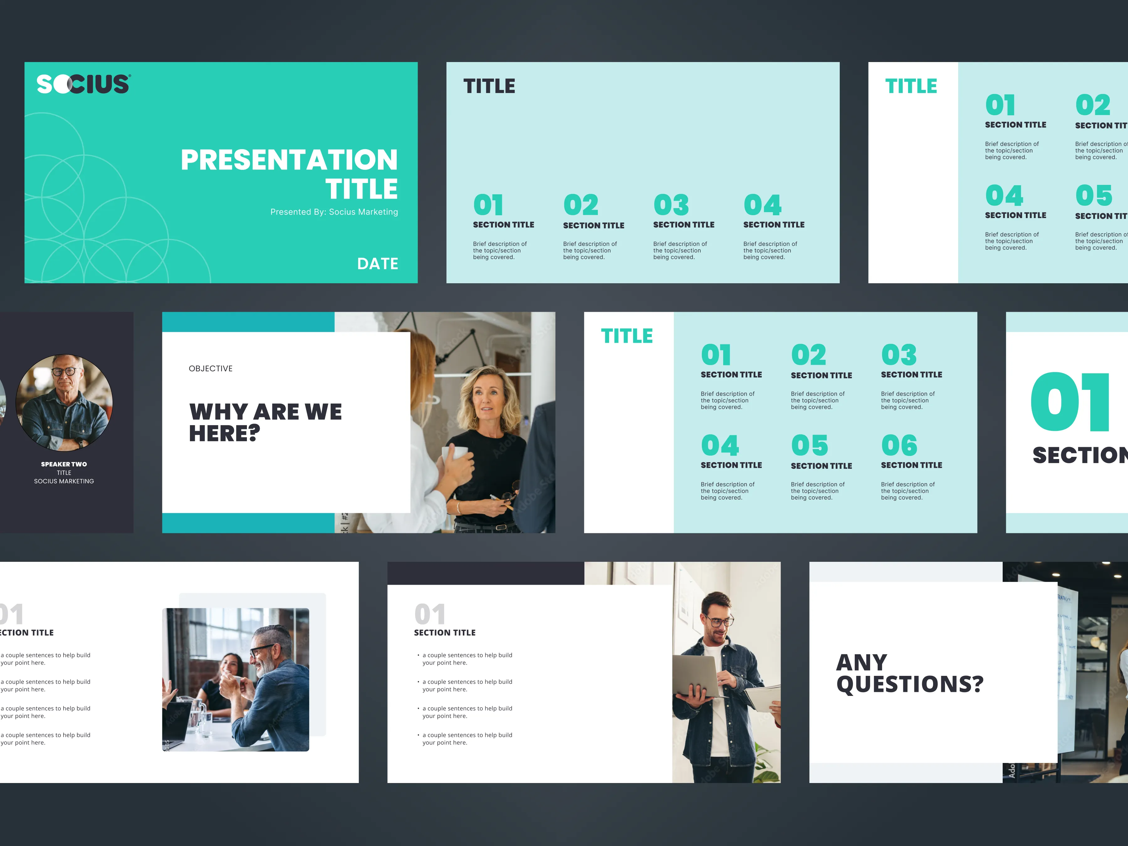
End-to-end rebrand for Socius Marketing, a B2B digital marketing agency whose visual identity had fallen behind their ambition. New logo, visual system, brand guidelines, and modular components rolled out across digital and physical touchpoints.
RoleSenior Designer
TeamVP Creative · Sr/Jr Designers · Web Dev
Timeline5 months · 2023
ToolsFigma · Adobe Creative Suite
StatusLive at sociusmarketing.com
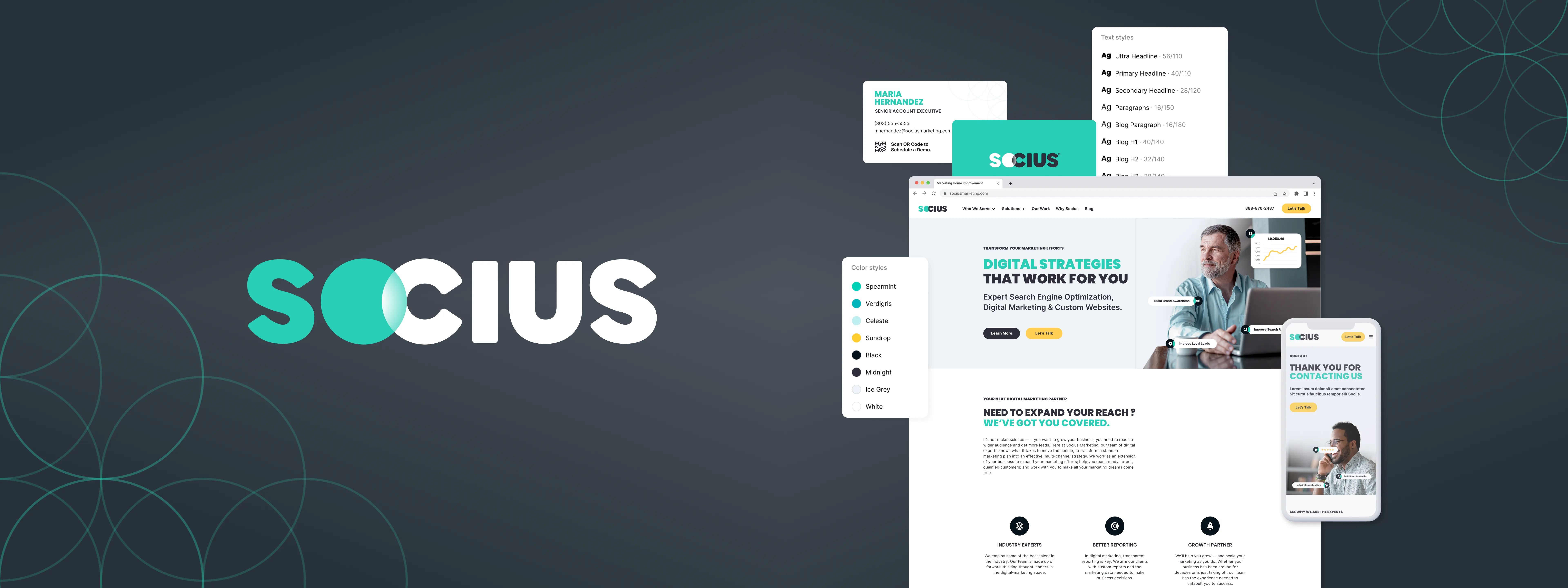
20+ pages
Full website built on a component system from scratch. New pages assembled in hours, not days.
Modular
Component variants, responsive breakpoints, and dev-ready style guide shipped
Self-serve
Marketing and sales built landing pages, decks, and documents without a design request
The problem I found
01
The brand felt outdated. Socius was selling marketing credibility to clients while their own identity undercut it at every touchpoint.
02
Visual language was inconsistent across channels. Website, email, social, and sales decks all looked like they came from different companies.
03
The identity didn't match the clients they wanted. They were targeting healthcare and home services companies but looked like a generic agency.
04
No reusable system. Every campaign meant starting from scratch. No shared components, no templates, no guidelines document.
What I shipped
01
New logo and visual identity. Three rounds of concept exploration. Stakeholder alignment at every stage. Final mark that works at any size without a tagline.
02
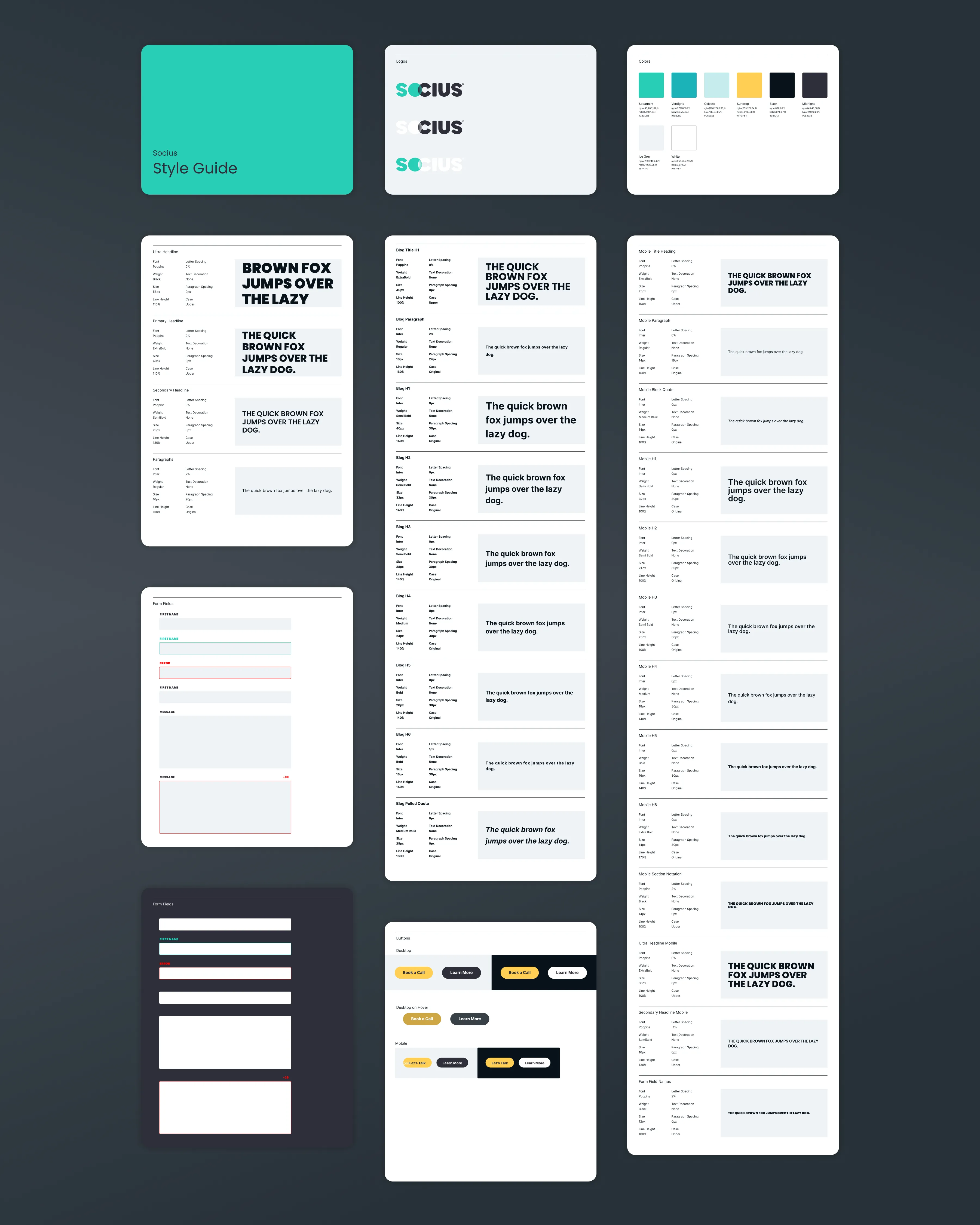
Semantic color system and typography. Two-color palette that scales to any context. Clean type hierarchy that stays readable across devices.
03
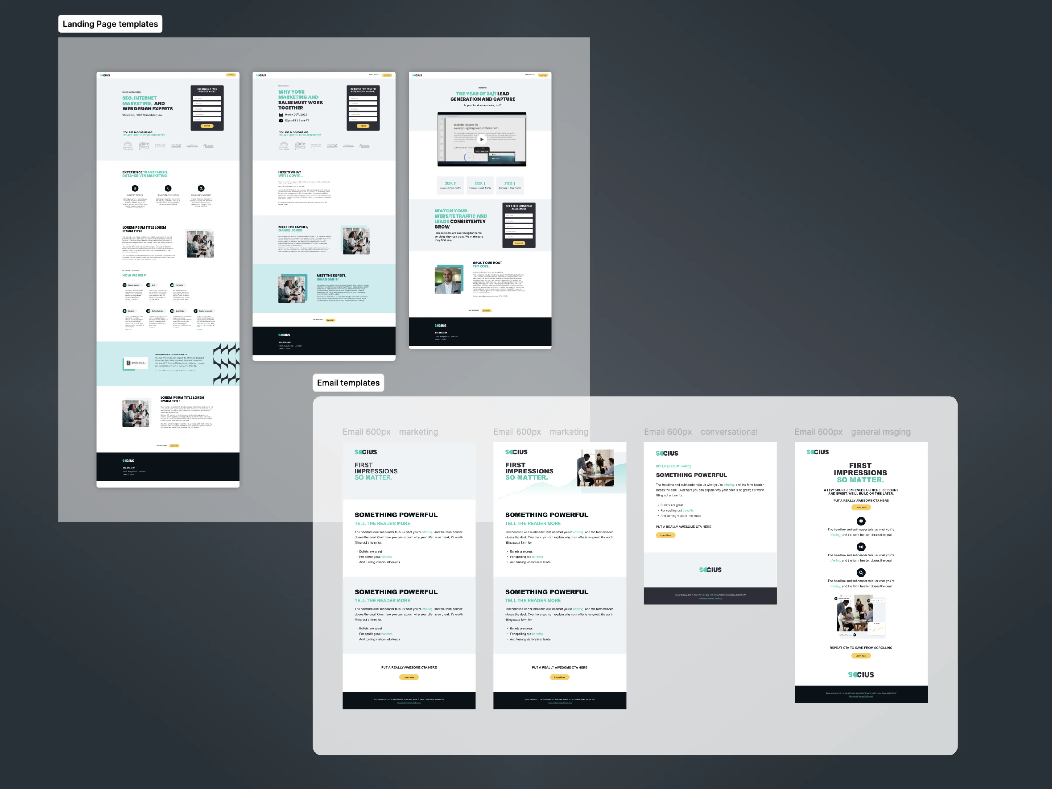
Modular components for campaigns. Reusable landing page blocks, email templates, and social assets the team could assemble without a designer.
04
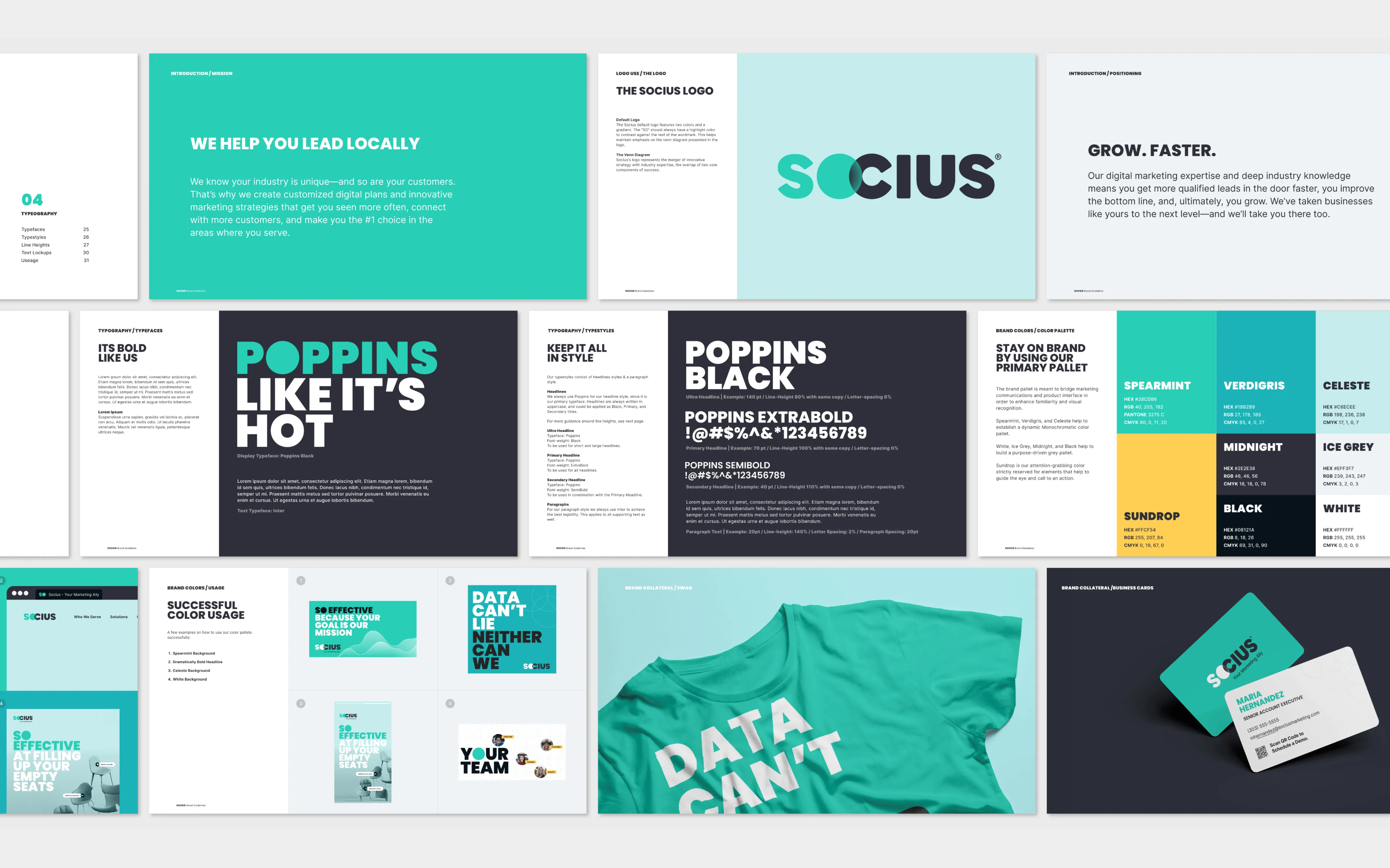
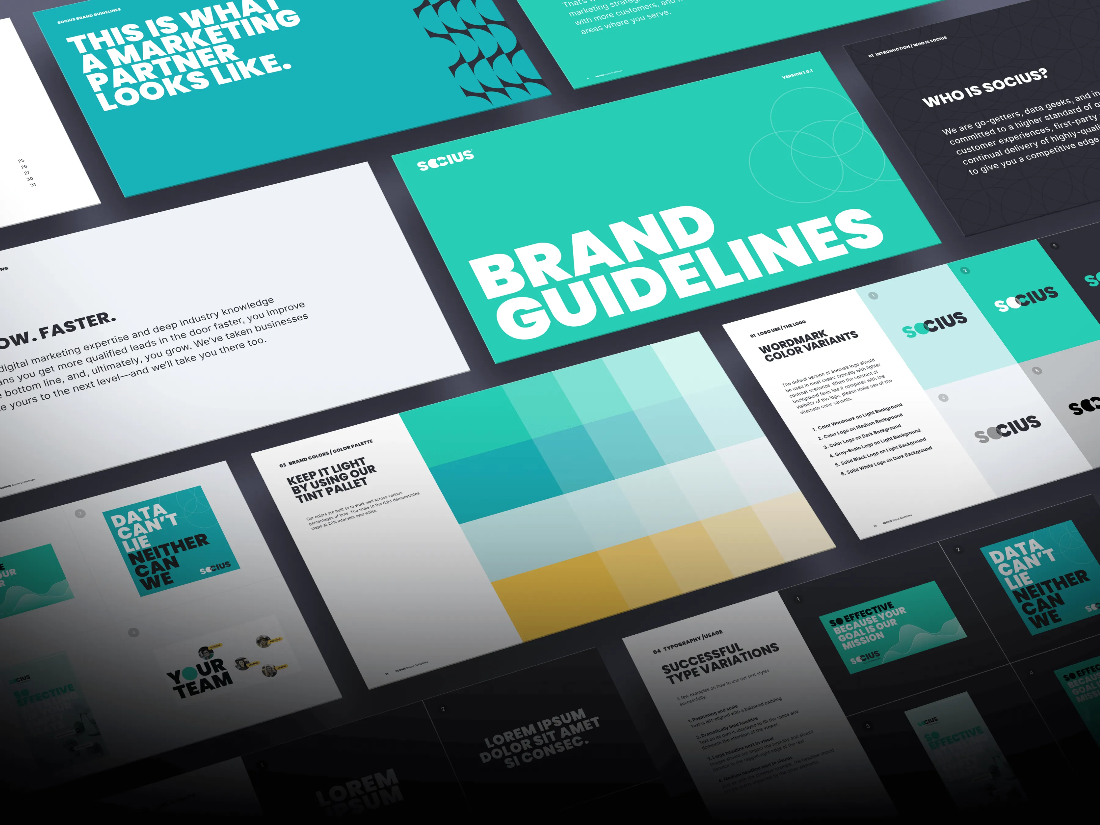
Brand guidelines and template library. A document the team actually uses. Clear rules, real examples, usable templates.
What I owned
Led the creative direction across the full engagement.
01
Ran stakeholder interviews to align brand positioning across leadership
02
Mapped the B2B digital marketing landscape through a competitive audit
03
Designed the logo from concept exploration through three rounds to final mark
04
Built the color palette, typography system, and web style guide for the dev team
05
Designed and built 20+ site pages using a modular component system built from scratch
06
Built component variants for buttons, dropdowns, alerts, navbars, footers, and text/image lockups
07
Designed breakpoints across devices, button states, and an icon service tag system
08
Wrote the brand guidelines, built the template library, and templated all sales enablement materials
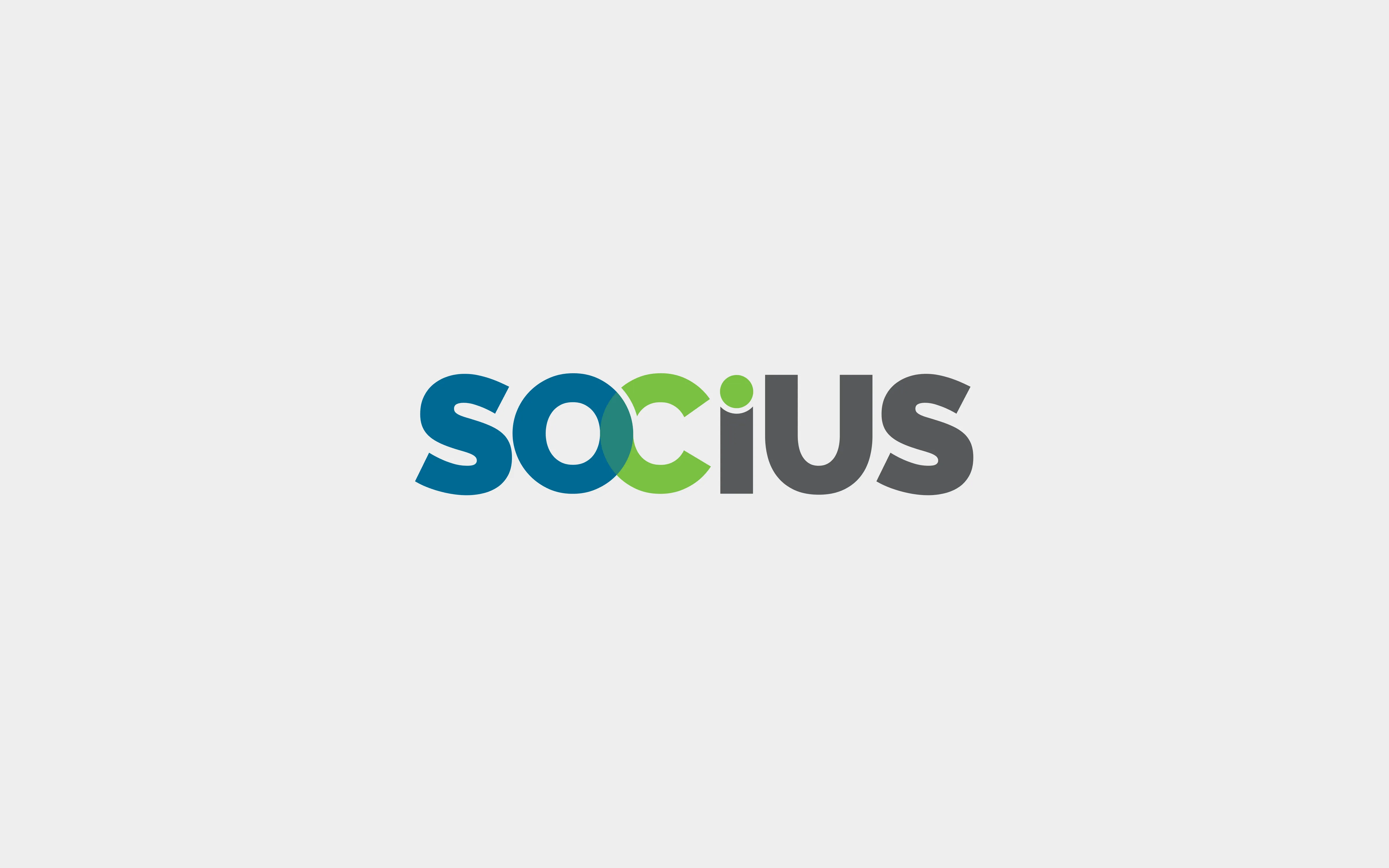
Before
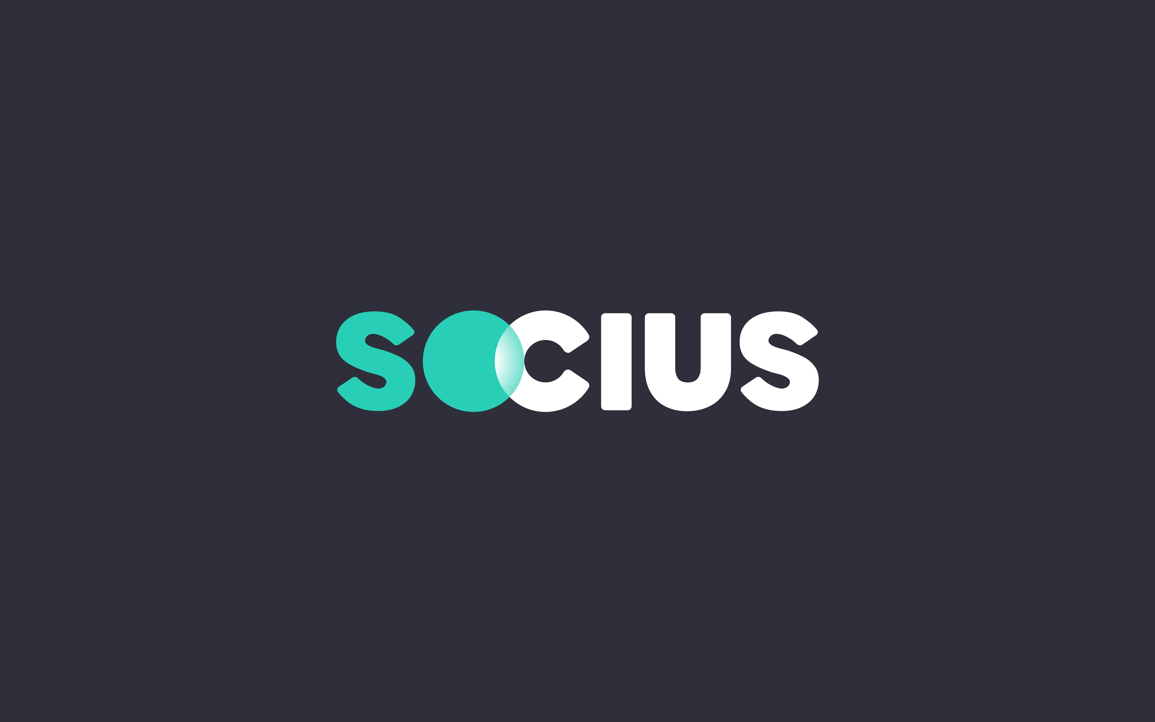
After
Before: what wasn't working
Three competing colors with no visual hierarchy
Mixed letterform weight felt unintentional
Required tagline. Mark could not stand alone.
Decorative elements without a unifying concept
After: decisions I made
Single mark concept with overlapping circles for connection
Two-color system. Teal and white. Nothing more.
Wordmark stands alone at any size or context
Consistent stroke weight. Confident and unified.
Logo evolution: old identity vs. new mark, color system, and visual rules
Concept rounds 1 and 2
Final direction
Three rounds of concept exploration before stakeholder sign-off · Click to enlarge
Approach
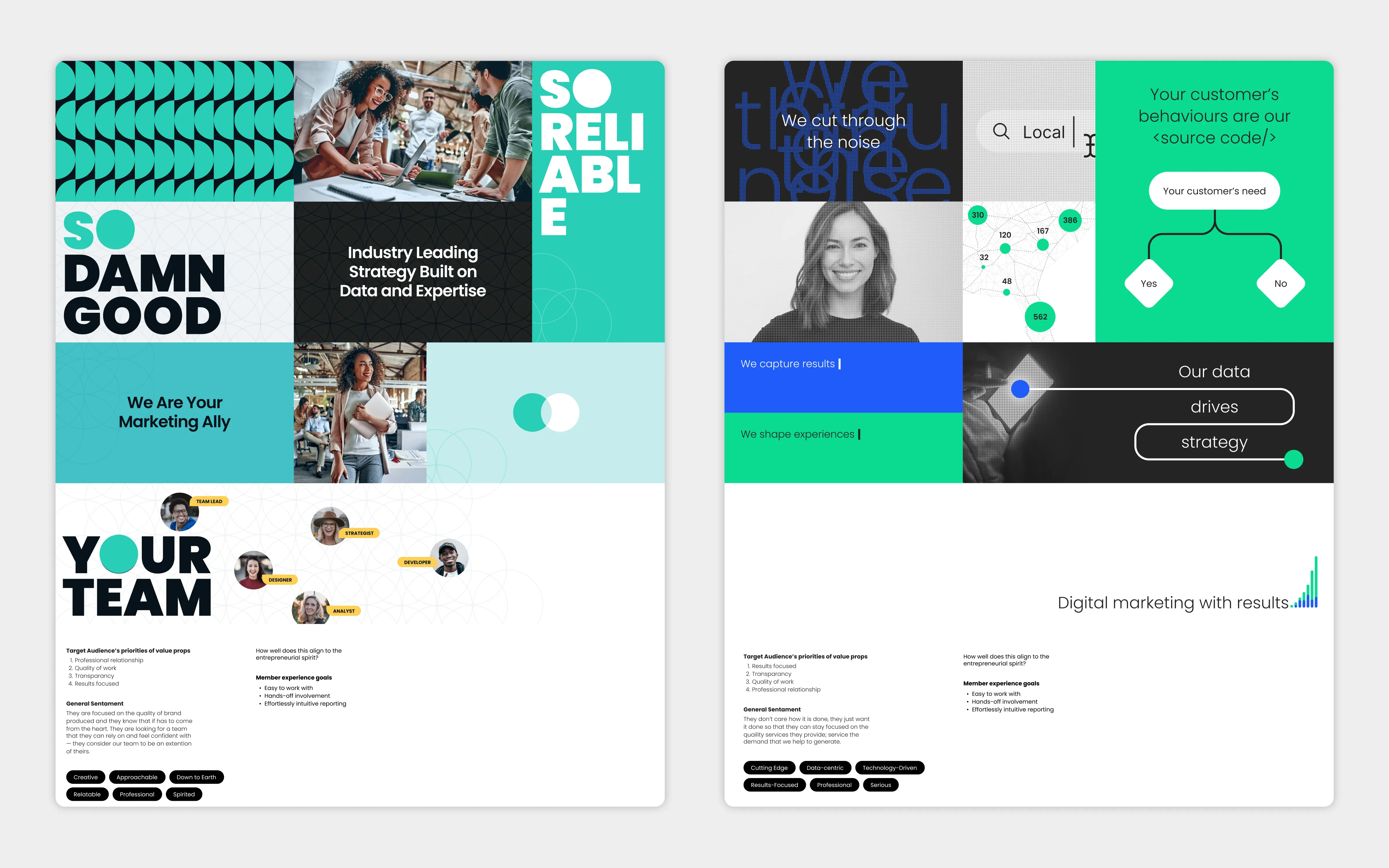
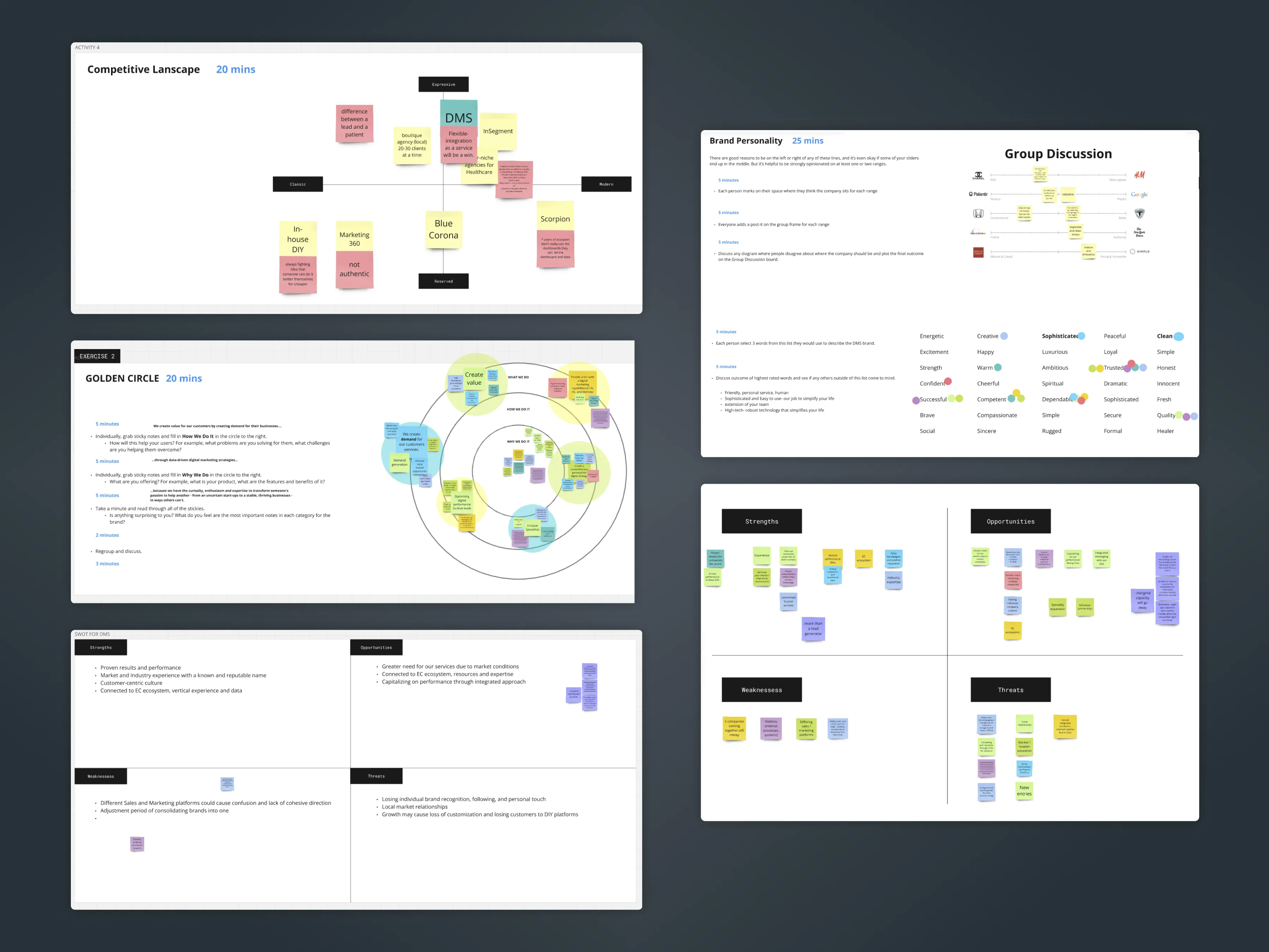
I started with research, not concepts. Ran stakeholder interviews across leadership to understand how they saw the brand versus how their clients experienced it. Reviewed site analytics and lead conversion paths to see where the existing identity was costing them. Bounce rates on service pages were high. The visual inconsistency between the website and sales materials was creating friction in the sales cycle.
Then I ran a competitive audit. Mapped how every B2B digital marketing agency in their space presented themselves. The landscape was flooded with the same blue-and-white corporate look. Socius had a strong reputation through word-of-mouth, but their visual identity told a completely different story online.
Key decision
We recommended Socius stop trying to be everything to everyone visually. They had a distinct point of view. Their brand needed one too. Narrowing the brand's personality before touching the logo was the call that made everything else easier.
Building for adoption
The biggest risk with any rebrand is that it ships and nobody uses it correctly. So I built the system with adoption in mind from the start. The guidelines document was not an afterthought. It was a core deliverable. Same with the modular components. If the marketing team could not assemble a landing page without calling a designer, the system would fail.
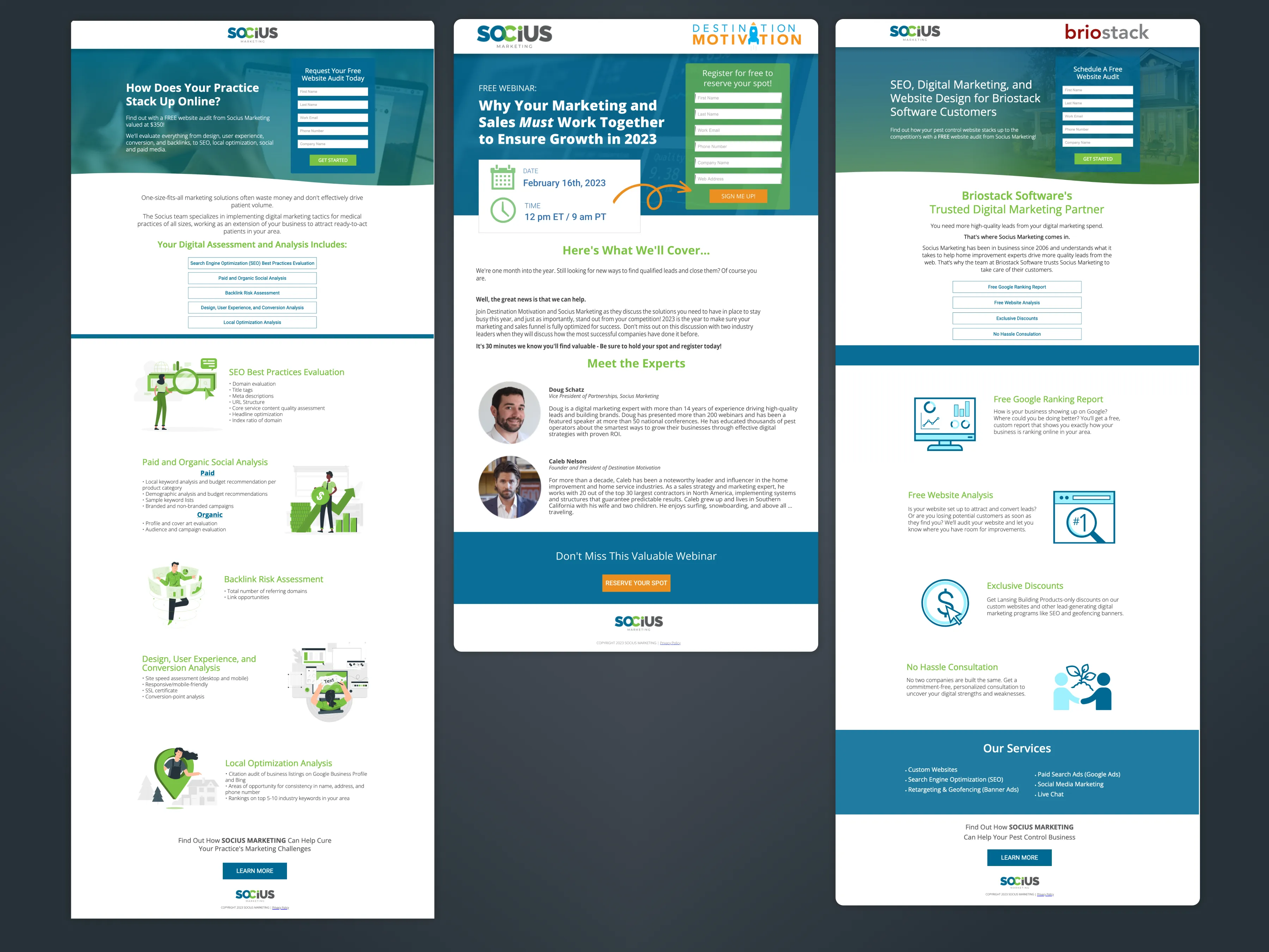
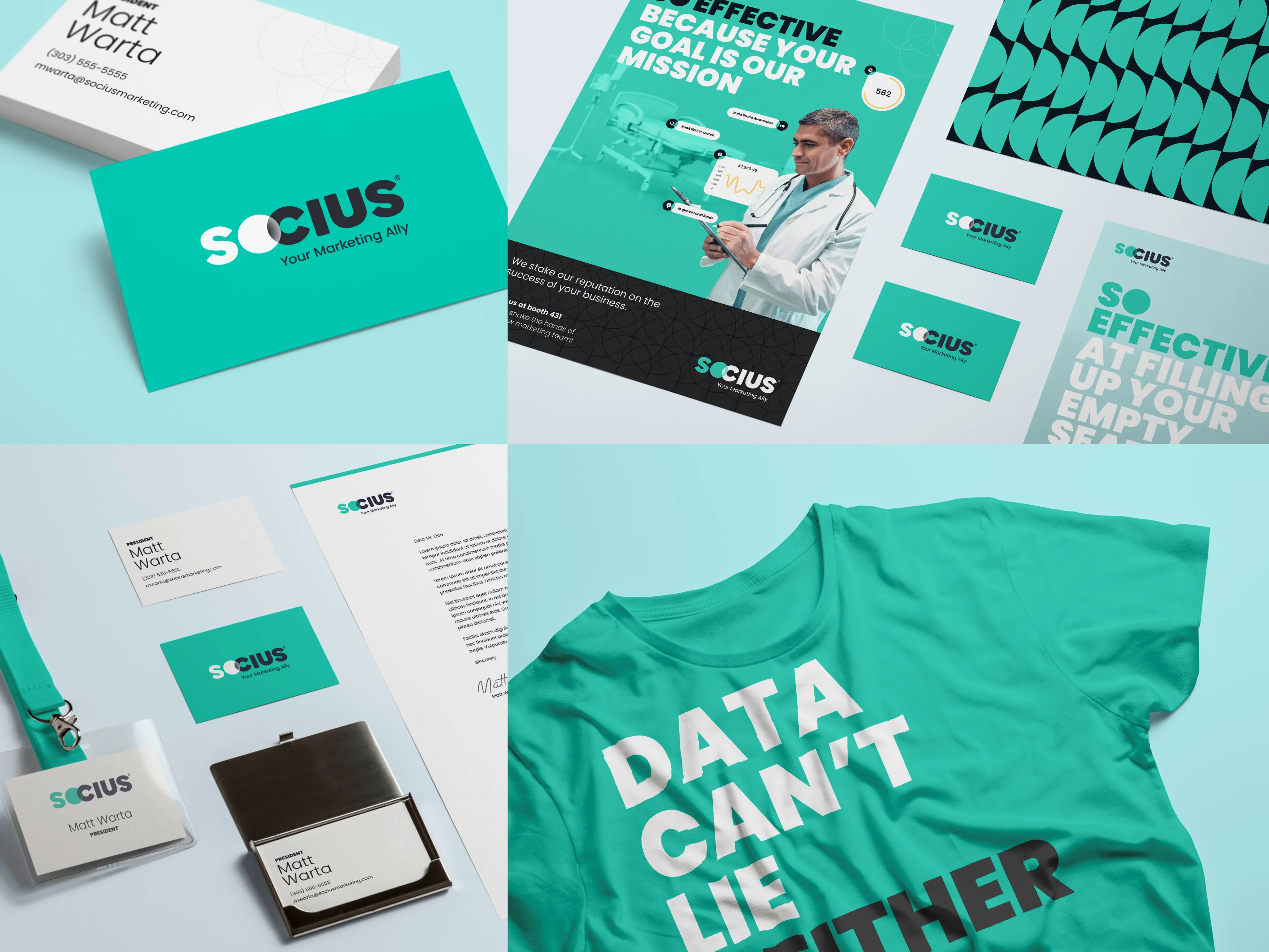
I templated everything: case study layouts, one-pagers, social cards, email headers, and sales decks. Every piece was built to be assembled, not designed from scratch each time. That's what turned a rebrand into something the team could actually own. After launch, marketing built landing pages and sales assembled decks without design in the loop. The system made that possible.
A brand refresh only works if the people who need to use it can use it without help. The guidelines matter as much as the logo.
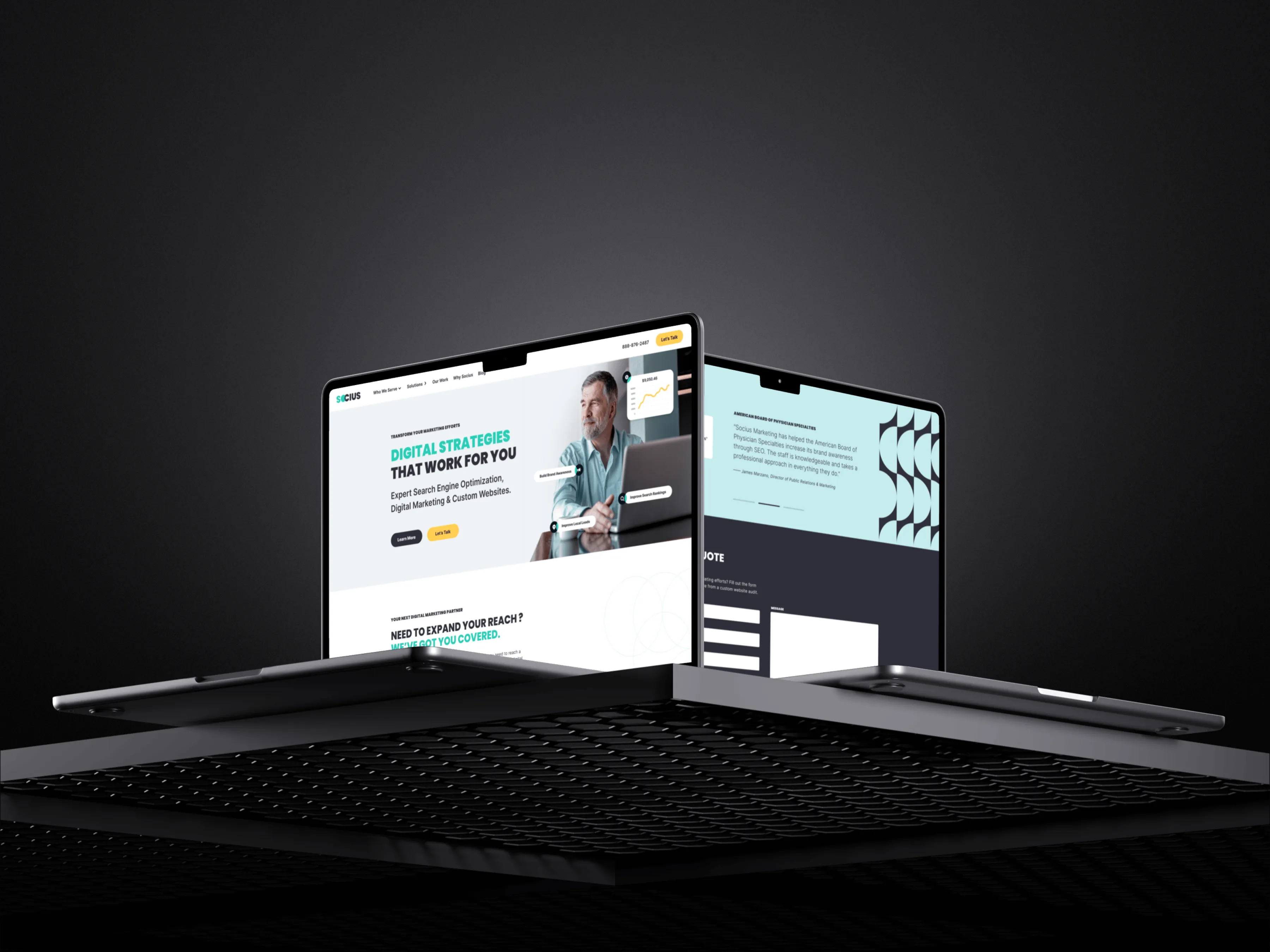
Building the website
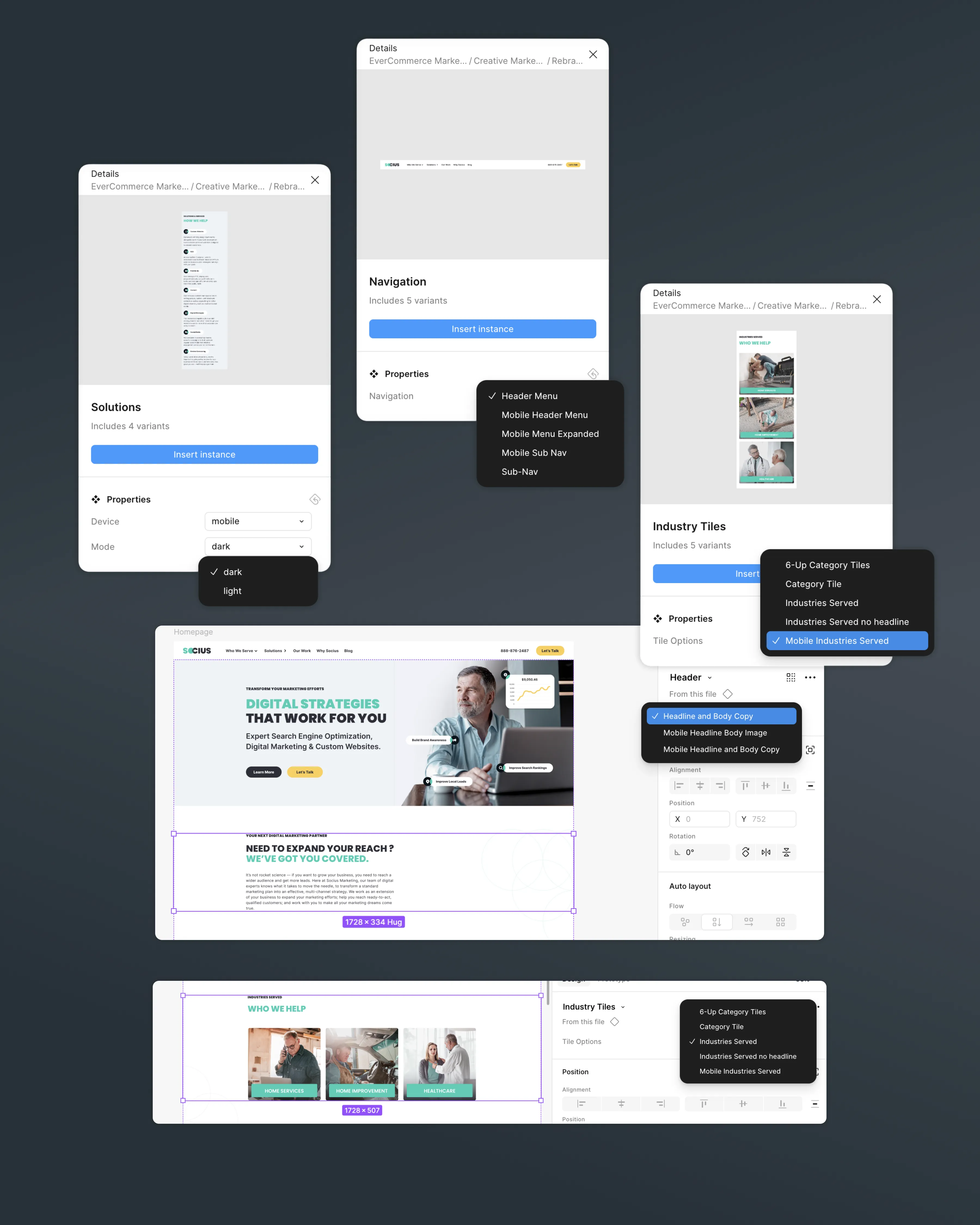
The rebrand was not just a logo and a PDF. I designed and built every page of the new website. 20 core site pages plus all case study and blog templates. I did not use an existing UI kit or framework. I built a modular component system from scratch.
The system used Figma component variants so the team could adjust size and style without breaking anything. Buttons, dropdowns, alerts, navigation bars, footers, column layouts, text-and-image lockups. All built with variants. I also created an icon service tag system that let you swap icons depending on what was needed for hero image overlay graphics.
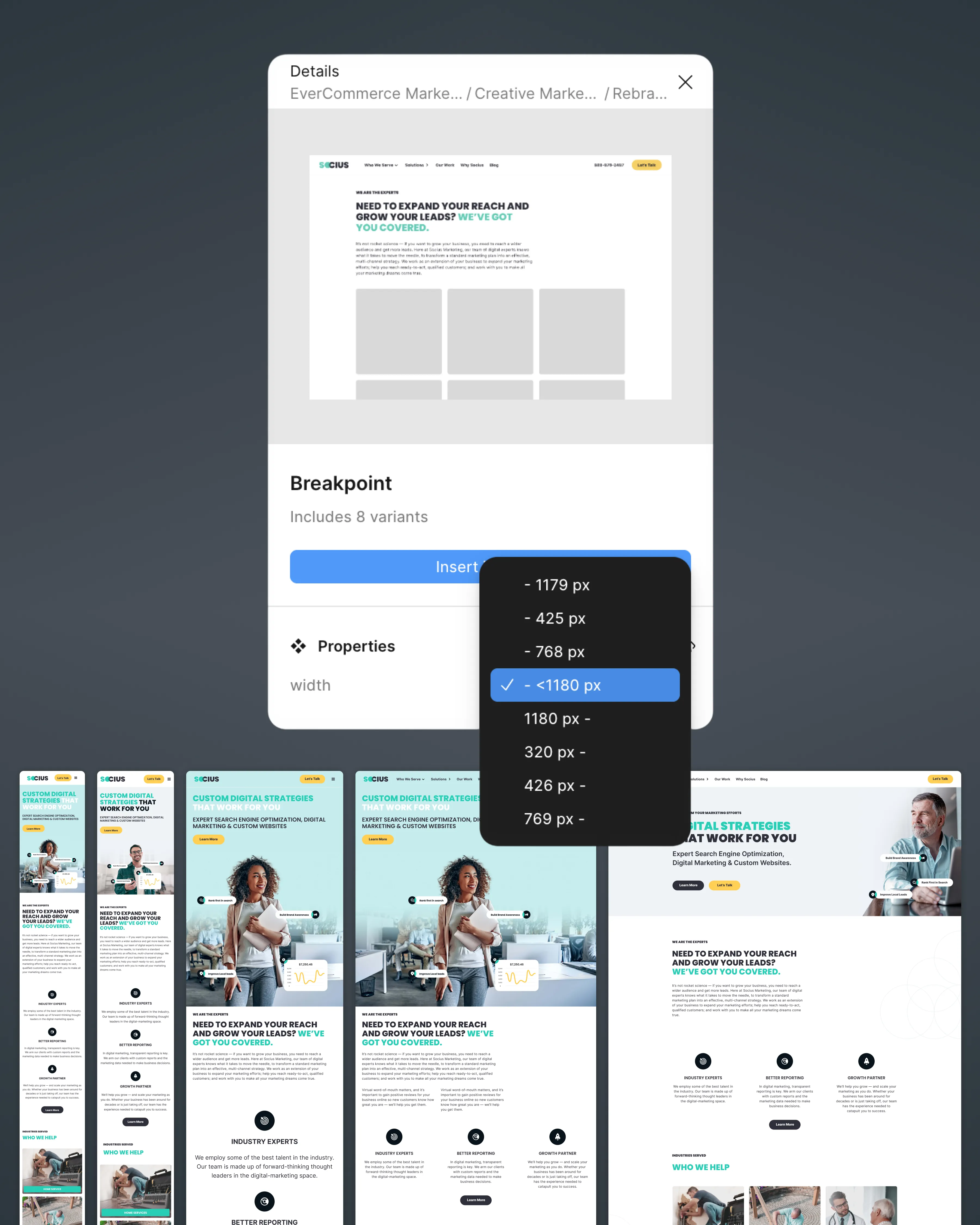
I explored breakpoints across devices, designed button states for static, hover, and active, and documented a web style guide for the dev team to build from. The dev team shipped the site directly from the style guide without needing to come back for clarification. That's how I know the documentation worked.
Key decision
I built the component system with variants instead of flattened one-off designs. It took more time upfront but it meant the team could update pages without me. A new case study page? Assemble it from existing blocks. A new service page? Same thing. The system scaled because it was designed to.
Component variant system
Responsive breakpoints
Web style guide for dev
Modular component system with variants, responsive breakpoints, and dev handoff documentation · Click to enlarge
Brand audit findings
HubSpot templates: before state
Competitive landscape
Brand audit across channels, HubSpot template review, and competitive landscape analysis · Click to enlarge
The challenge
The hardest part was not the visual exploration. It was the consolidation. Socius had good people, but different teams had been making visual decisions independently for years. The rebrand was not just a new logo. It was replacing years of uncoordinated decisions with a single, coherent system that everyone would actually use.
Key insight
We mapped brand perception across the competitive landscape. Every B2B digital marketing agency looked the same: blue, white, corporate. Socius needed to stand apart, not blend in. That insight drove the teal direction and the confident, minimal mark. Differentiation was a business decision, not just a design preference.
What I learned
Building the component system for the website changed how I approach every project now. I do not design pages. I design the system that generates pages. That shift in thinking carried directly into my design systems work at EverHealth.
The other lesson was about handoffs. The dev team shipped the site from my style guide without needing to come back with questions. That only happened because I documented intent, not just specs. I wrote the reasoning behind spacing decisions, color choices, and interaction patterns. When engineering understands why, they make better decisions on the edge cases you did not anticipate.
I don't design pages anymore. I design the system that generates them. That shift started here.
Website (live)
Brand guidelines
Sales enablement
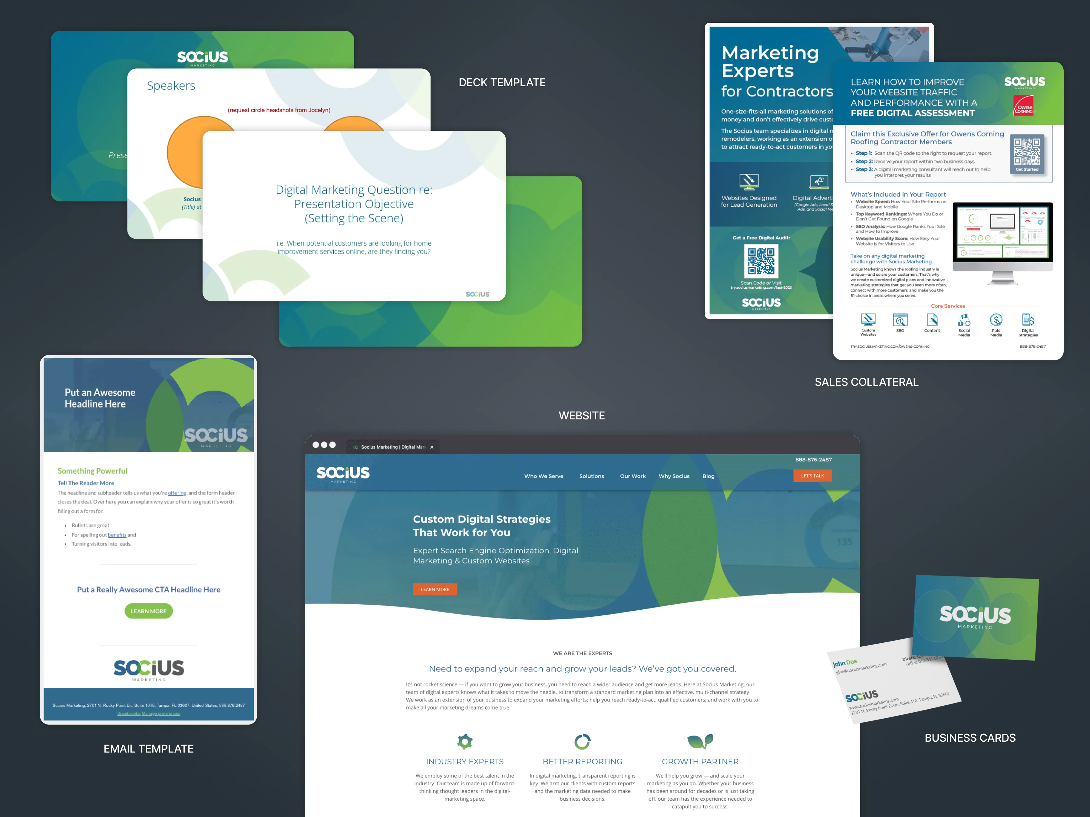
Final deliverables: live website, brand guidelines, and sales enablement materials · Click to enlarge
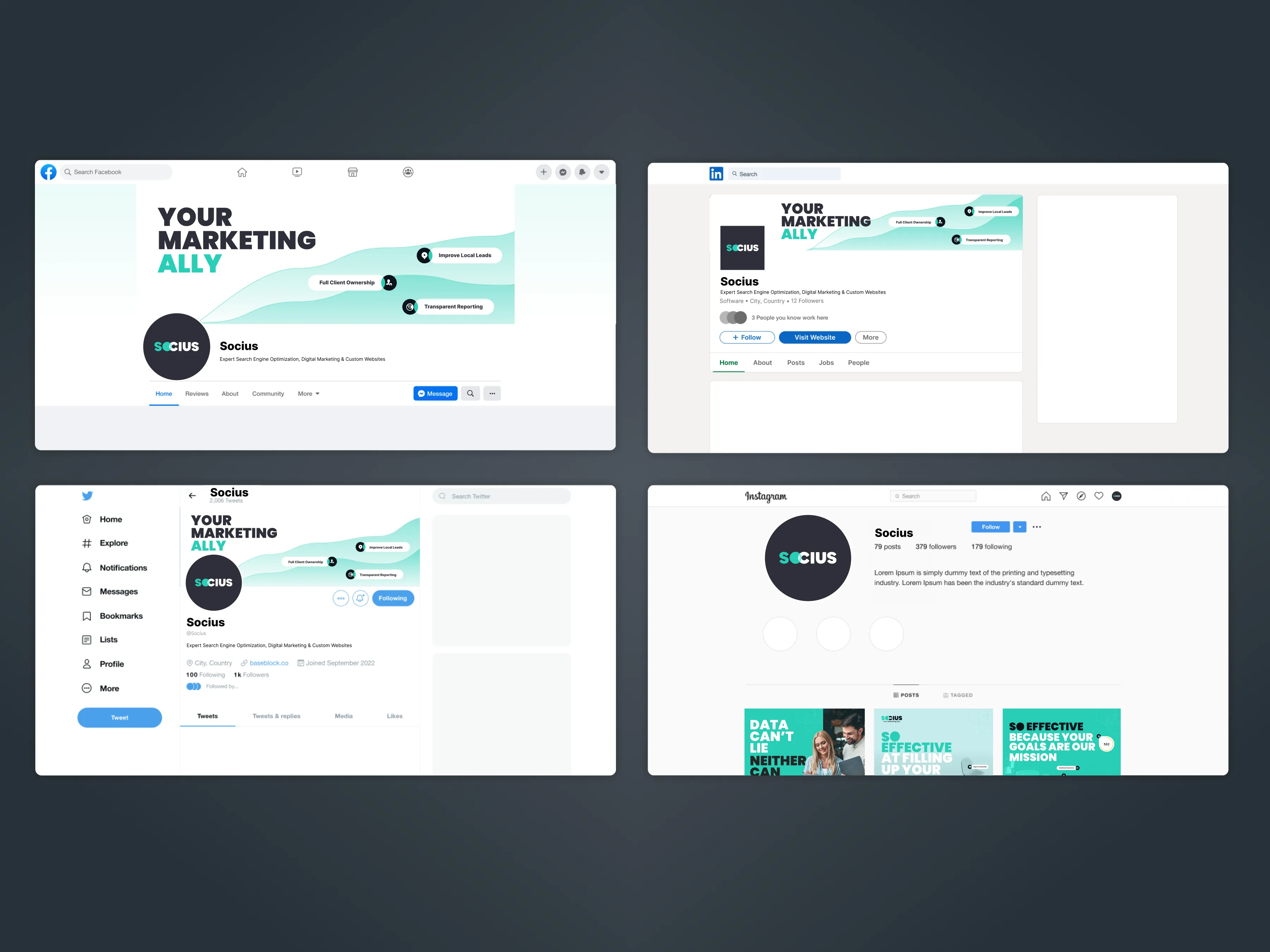
Social templates
Modular components
Physical touchpoints
Social templates, modular component library, and physical touchpoints · Click to enlarge
20+ pages
Full website on a modular component system built from scratch
5 months
End-to-end from research to live rollout across all touchpoints
Self-serve
Marketing and sales built landing pages, decks, and documents without a design request