End-to-end UX and product design for Physio, a mobile app helping physical therapy patients stick to their home exercises. Research-driven. Prototyped in Figma. Tested with real patients and therapists.
RoleUX Designer
TeamSolo
Timeline12 weeks
ScopeUX Research · End-to-End Design · Mobile
StatusFigma Prototype
10+
Patients and therapists interviewed during discovery research
80%
Of testers found the app easier to use than traditional exercise sheets
90%
Said they would be more likely to complete their rehab exercises using the app
The problem I found
01
Patients don't do their exercises. Adherence to home rehab programs is low. Recovery stalls. Readmission rates go up. The tools they are given do not help.
02
Paper instructions and complex portals. Most patients get a printed sheet or a clunky web portal. Neither is engaging enough to build a daily habit.
03
No feedback loop between visits. Therapists have no way to check patient progress between appointments. Patients feel unsupported between sessions.
04
Tracking is manual or nonexistent. Patients cannot see their own progress. Without visible improvement, motivation drops fast.
What I designed
01
Personalized exercise plans with video. Step-by-step demonstrations tailored to each patient's recovery stage. Clear, visual, and easy to follow at home.
02
Progress tracking with visual indicators. Patients see how far they've come. Small wins keep them motivated. Therapists see the same data remotely.
03
Direct therapist messaging. Secure in-app communication. Patients ask questions between visits. Therapists respond without scheduling a call.
04
Smart reminders and check-ins. Push notifications and daily check-in prompts that keep patients on track without feeling like nagging.
What I owned
End-to-end. Research through prototype.
01
Interviewed 10+ patients and physical therapists to map pain points
02
Synthesized research into user journeys and key insights
03
Defined information architecture and core user flows
04
Built low-fidelity wireframes and tested with real users
05
Designed high-fidelity screens for iOS (full app, all states)
06
Built an interactive Figma prototype for stakeholder validation
07
Ran usability testing and iterated based on findings
08
Created a component-based design system for the app
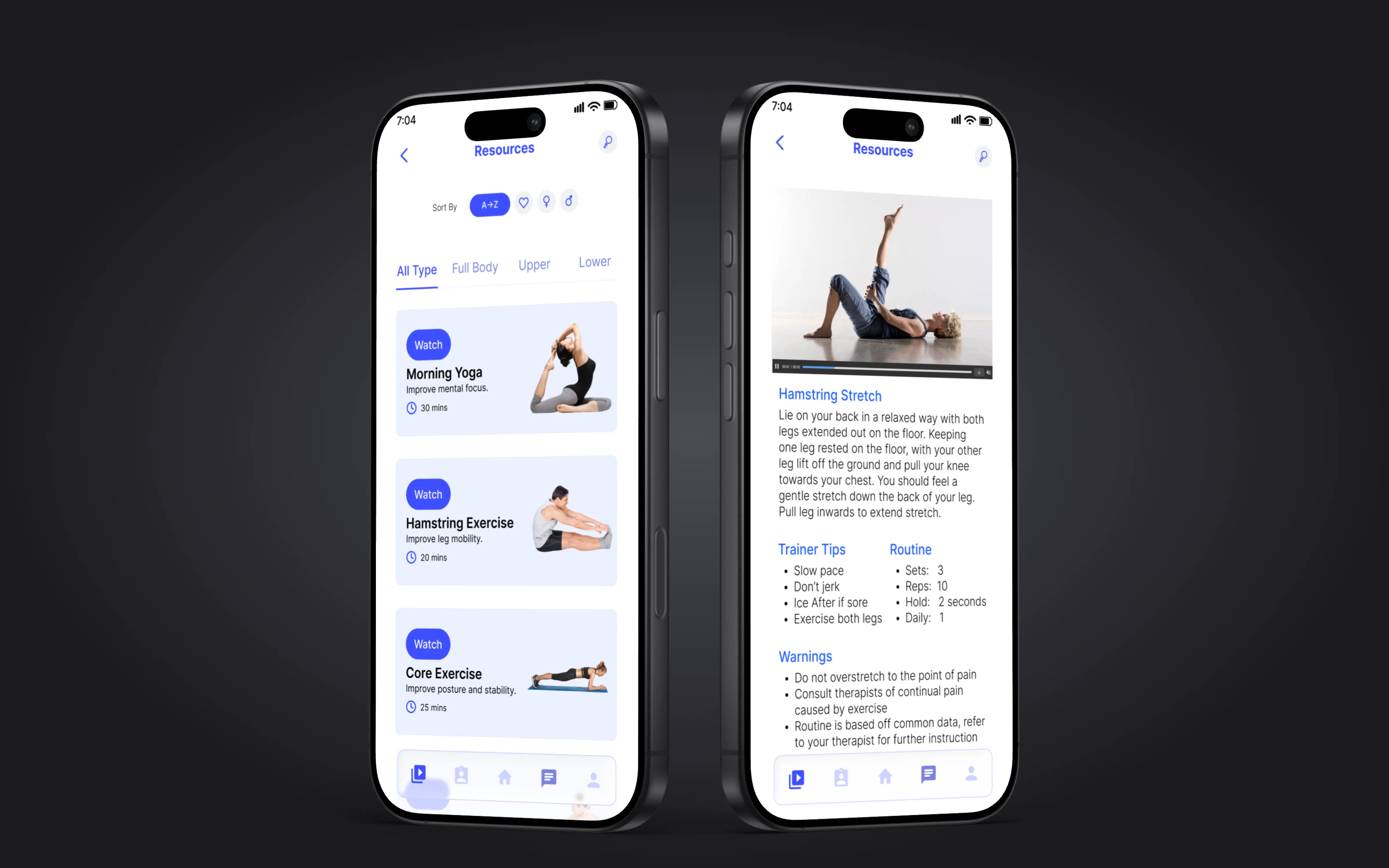
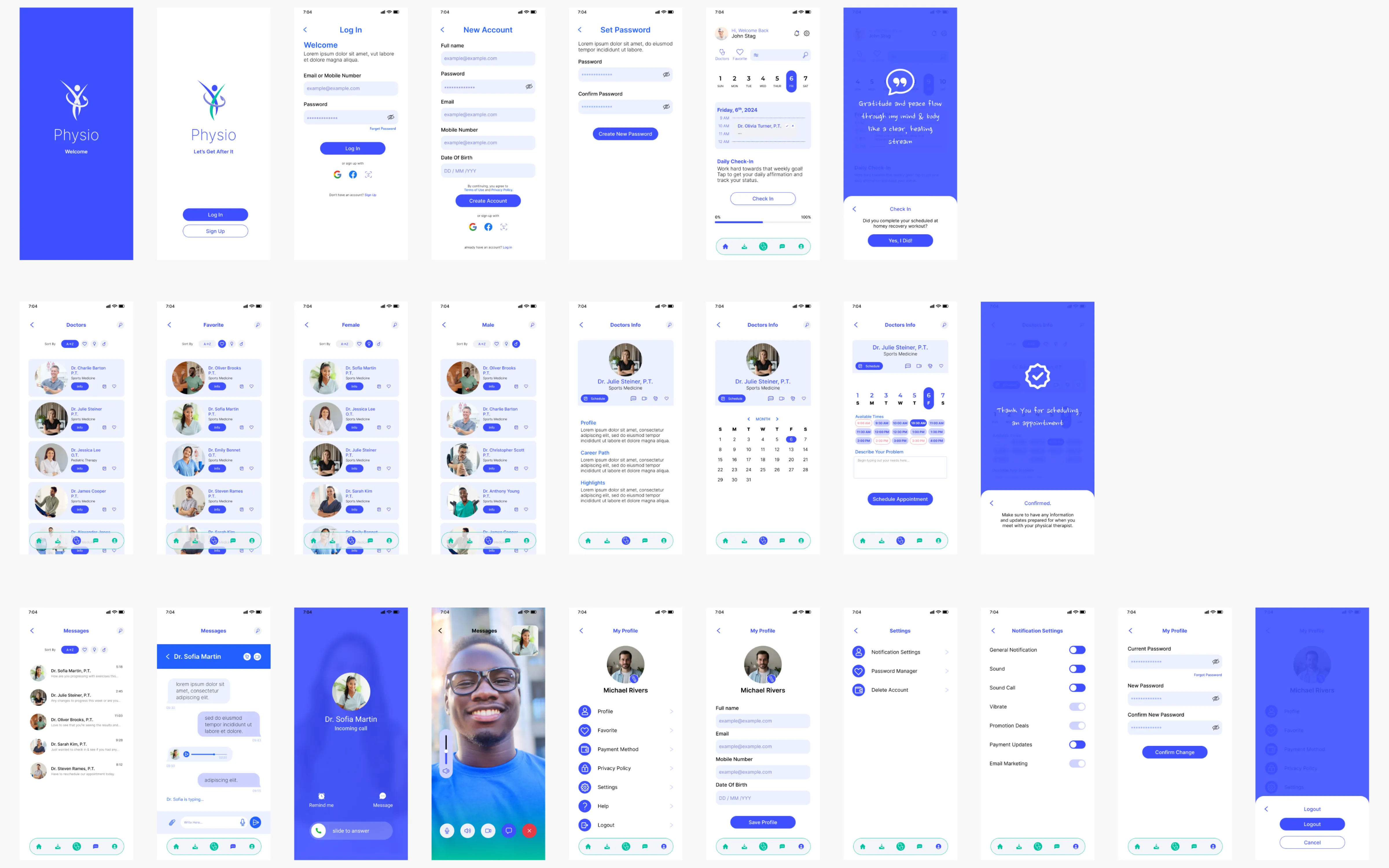
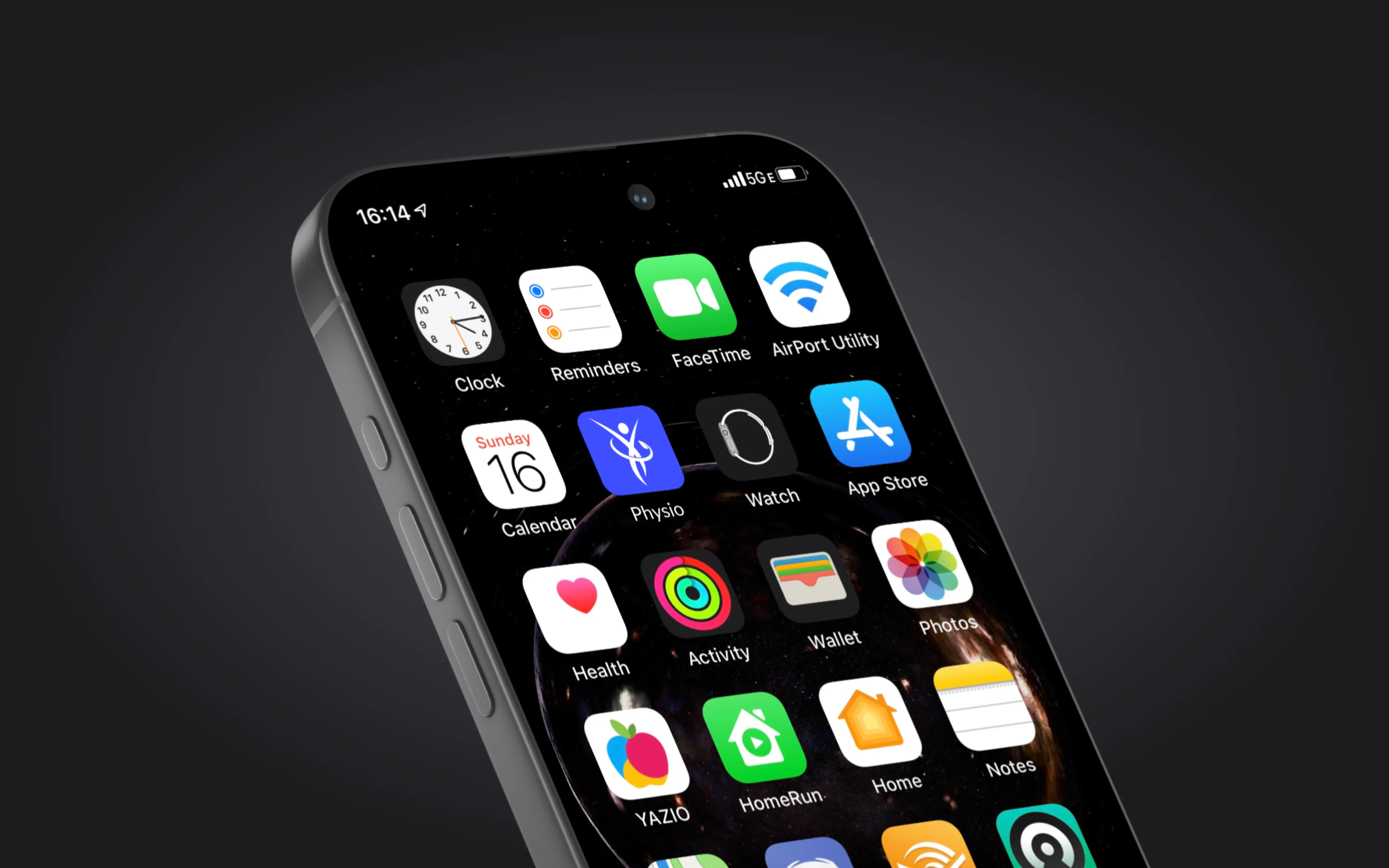
Exercise library
Welcome and login
Core app screens: exercise library and onboarding experience · Click to enlarge
Research
I started by talking to people. Interviewed 10+ patients currently in physical therapy and several practicing therapists. I wanted to understand the real workflow, not assumptions about it.
Three patterns came up consistently. Patients need more visual guidance for exercises. Most forget to do their routines because nothing reminds them. And therapists have no quick way to check patient progress between visits. Everything between appointments is a black box.
Key insight
The biggest barrier to adherence was not motivation. It was clarity. Patients wanted to do their exercises but were not sure if they were doing them correctly. That insight shifted the design from a tracking app to a guided experience with video demonstrations front and center.
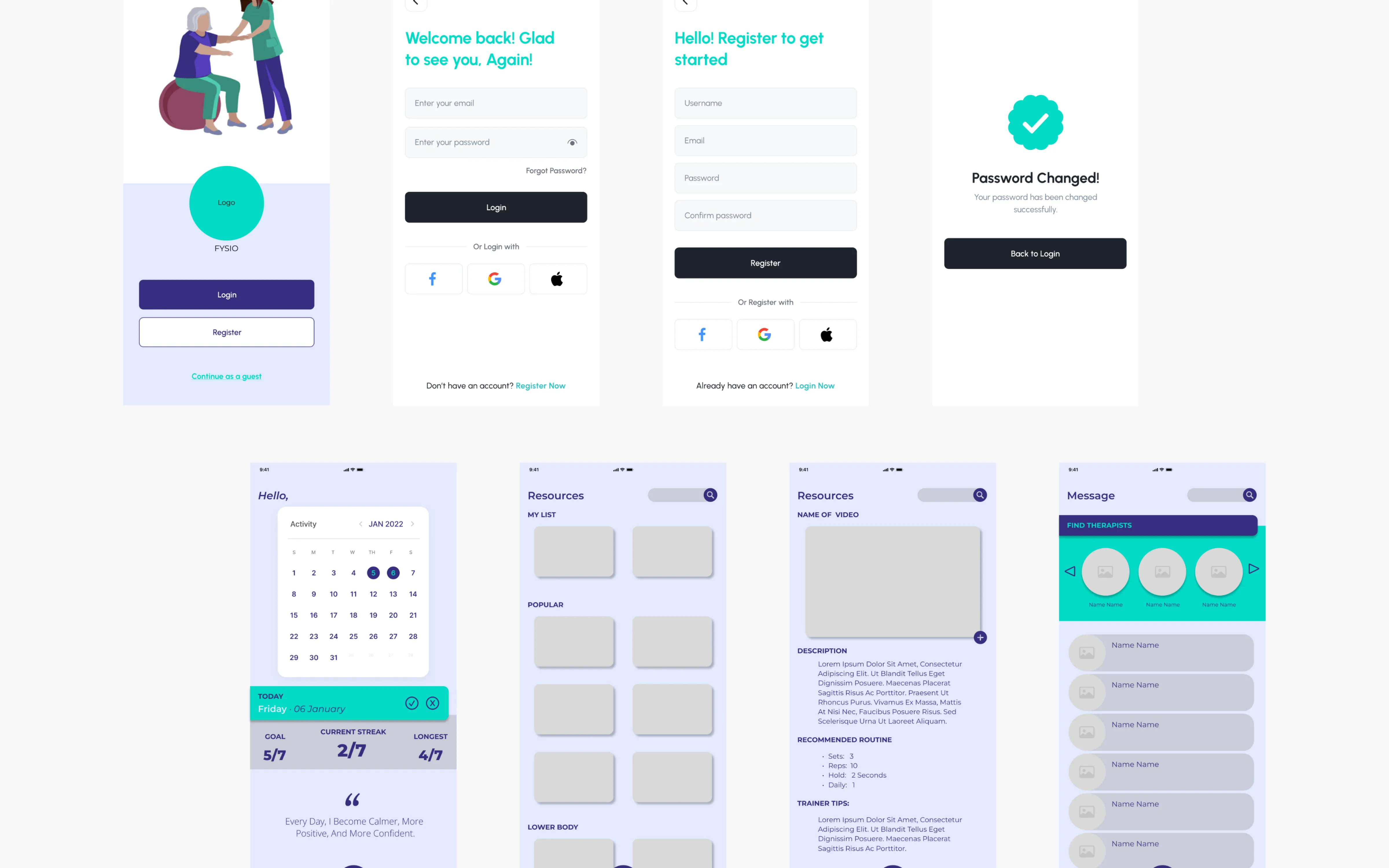
Wireframing and testing
After mapping the user flows, I built low-fidelity wireframes in Figma. Kept them rough on purpose. I wanted feedback on structure and navigation, not visual polish.
Tested the wireframes with 5 participants from the interview group. Two things changed immediately: the exercise detail screen needed bigger, clearer video placement, and the messaging feature needed to be accessible from anywhere in the app, not buried in a separate tab.
User flow mapping
Key screen wireframes
Navigation structure
Low-fidelity wireframes tested with real users before moving to high-fidelity · Click to enlarge
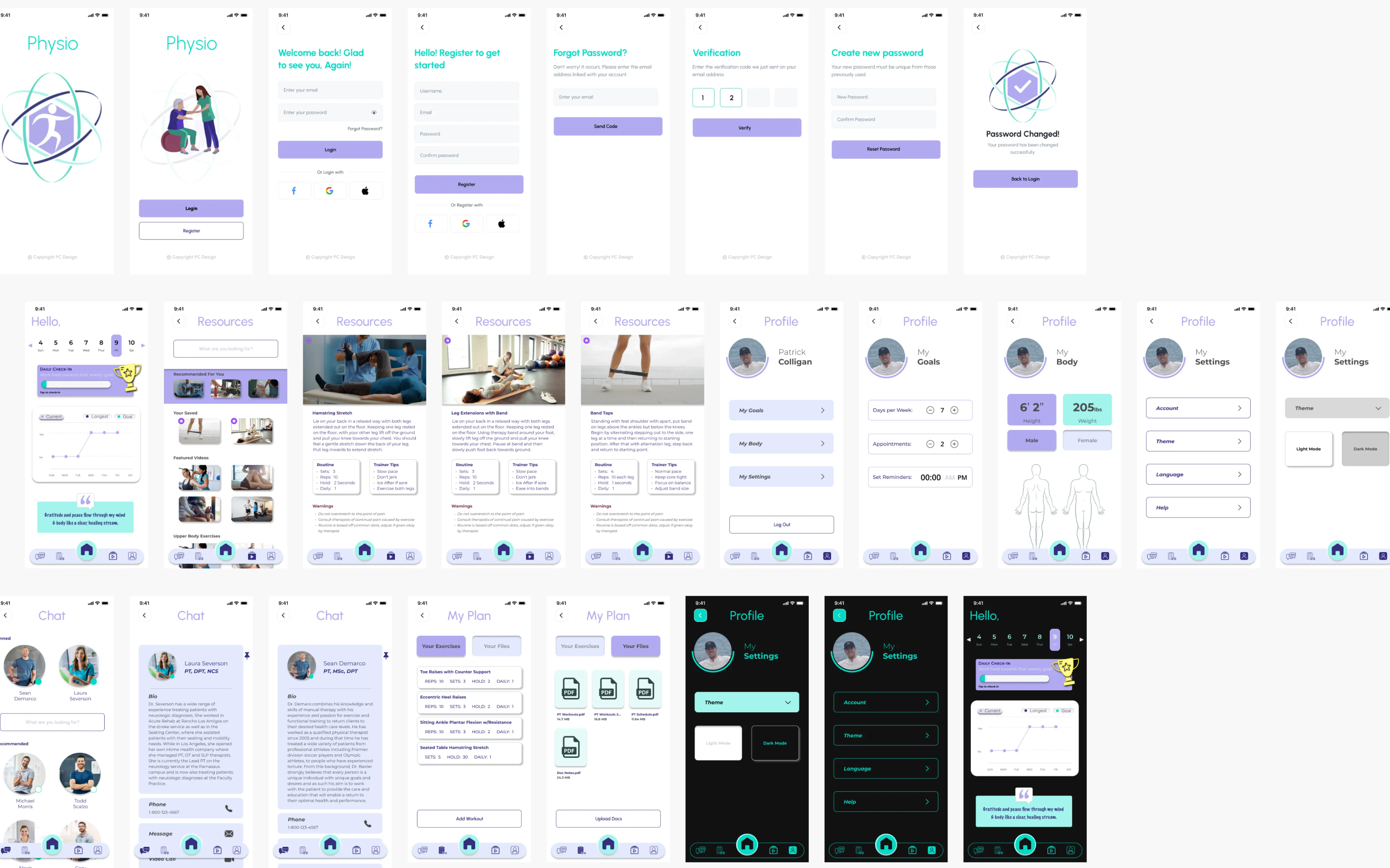
High-fidelity design
The final designs use a minimalist UI with a calming color palette. Large interactive buttons. Video integration for guided exercises. The goal was to make the app feel supportive, not clinical.
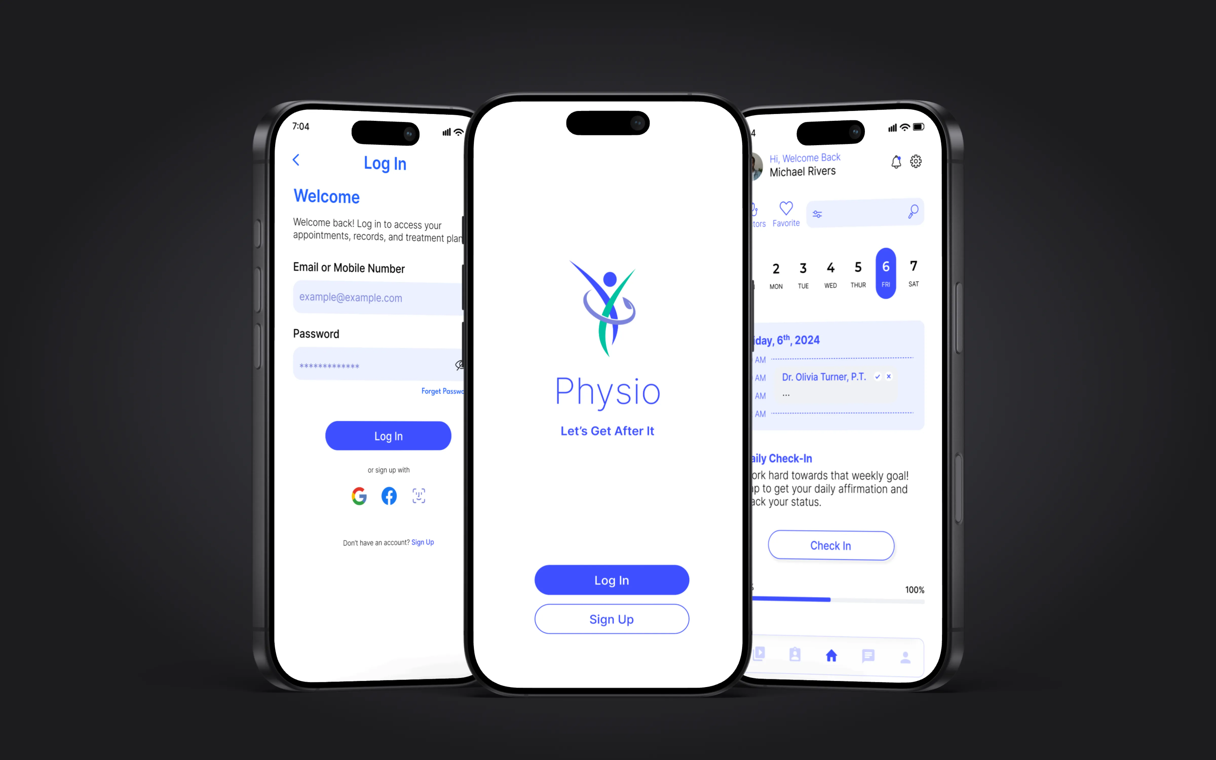
I designed the full screen set: onboarding, login and registration, home dashboard, exercise library with filtering, individual exercise detail with video and instructions, progress tracking, appointment scheduling, therapist messaging, profile and settings, and Apple Watch check-in companion.
Key decision
I kept the navigation to five tabs: Home, Progress, Exercises, Messages, and Profile. Every user task is reachable in two taps or fewer. During testing, users said it felt simple. That was the point. Patients recovering from injury do not want to learn a complex app.
Full screen inventory
Onboarding and authentication
Complete screen set and onboarding flow
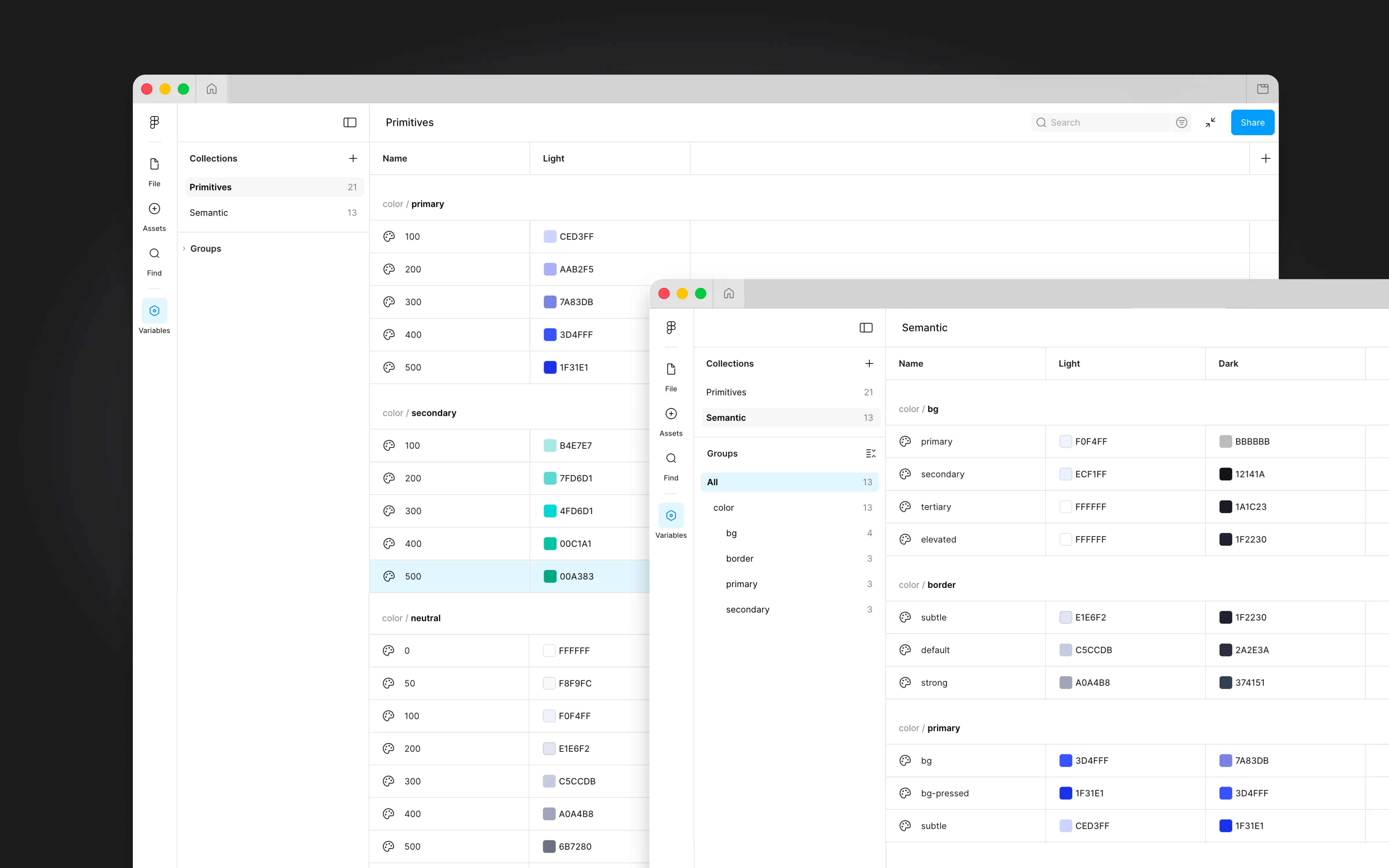
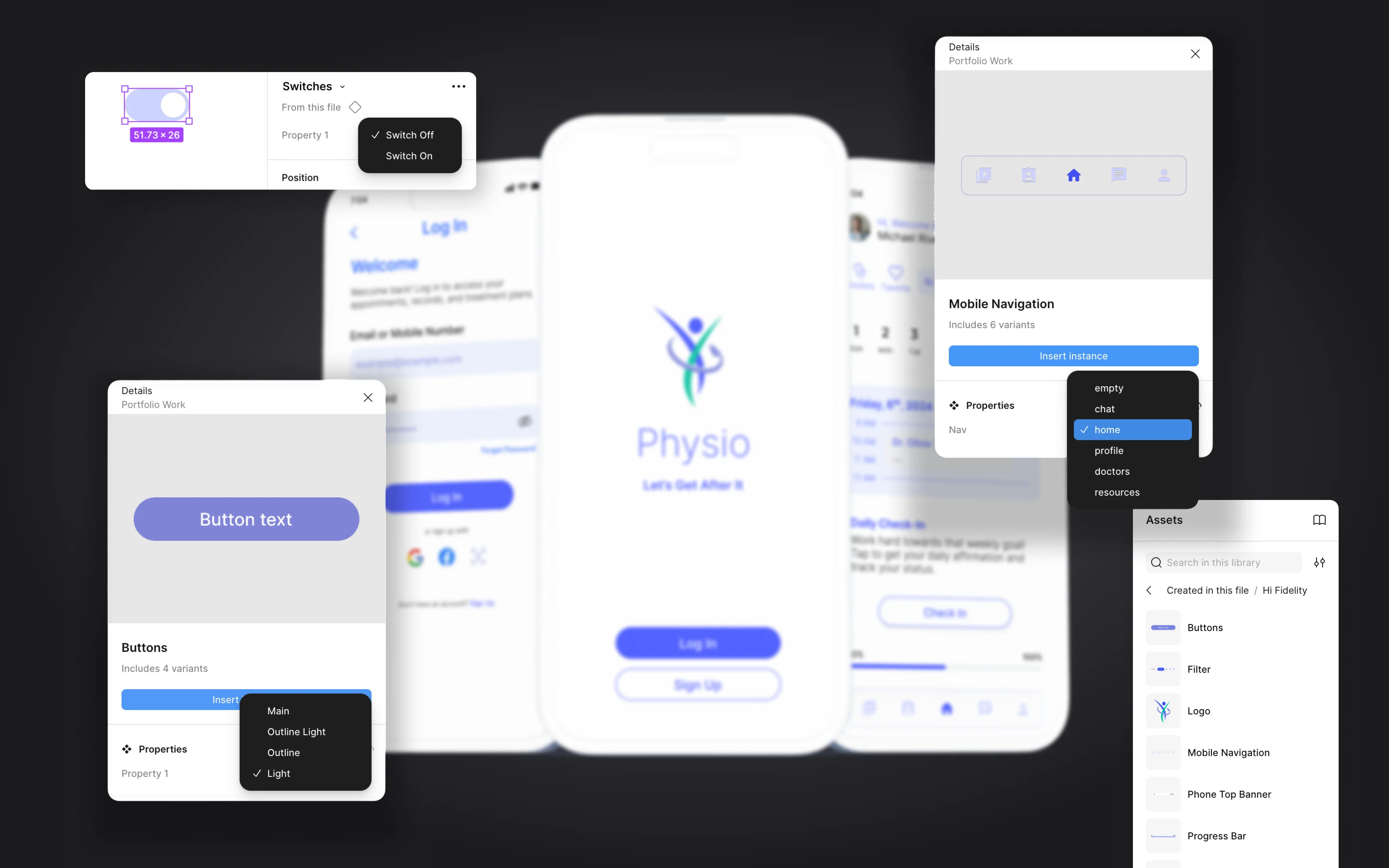
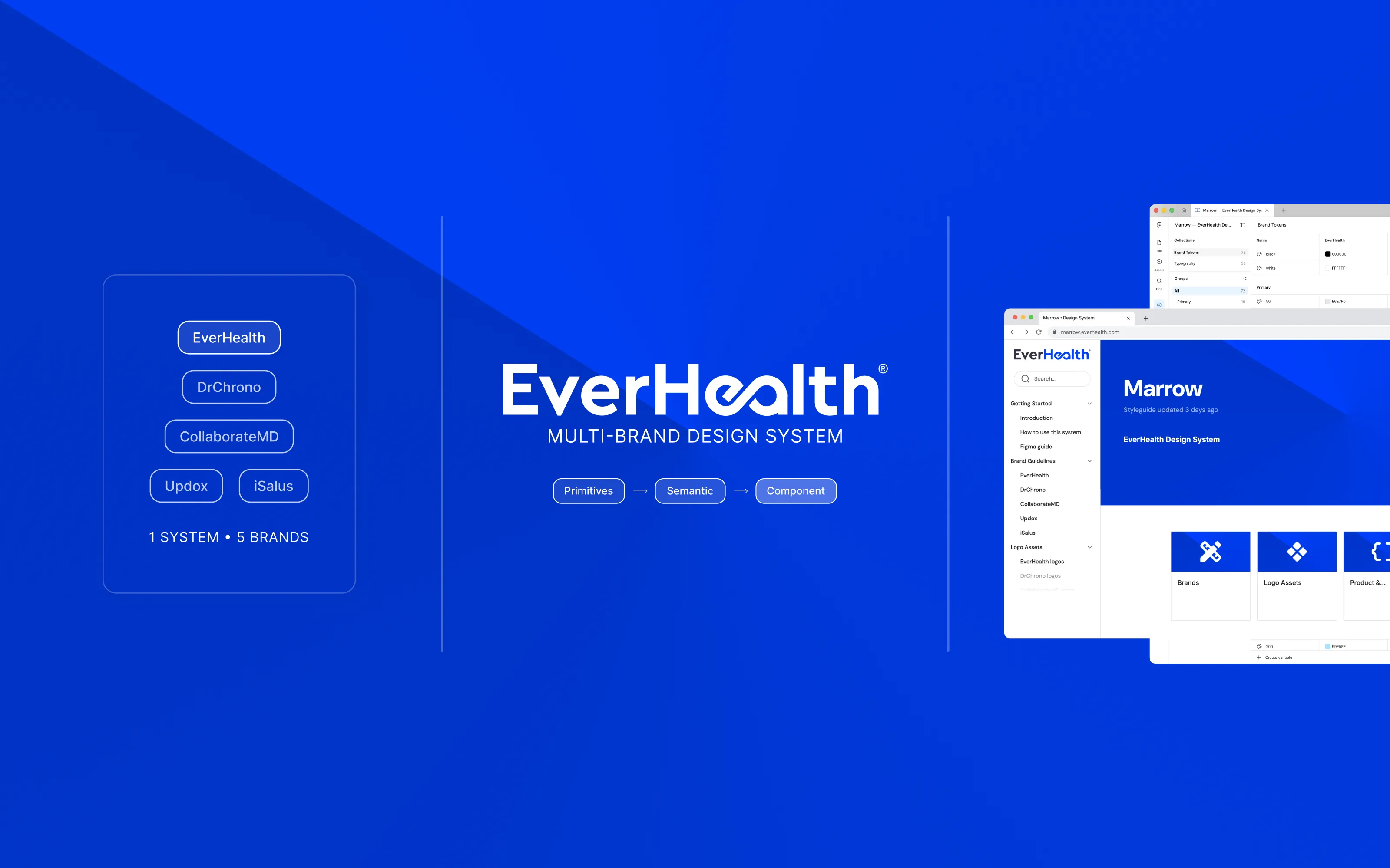
Component design system
Full component library
Design system built for the app: components, tokens, and reusable elements · Click to enlarge
Testing results
Ran usability tests with the high-fidelity prototype. 80% of users found the app easier to use than traditional paper exercise sheets. 90% said they would be more likely to complete their rehab exercises with this app compared to their current method.
The two features users responded to most: the video exercise demonstrations and the therapist messaging. Clarity beat complexity every time. Patients felt connected between appointments for the first time.
What I learned
This project taught me that users prioritize simplicity over features. Every time I considered adding something, I asked whether it helped someone do their exercises. If it did not, it got cut.
The research changed the product direction. I went in thinking this was a tracking app. The interviews showed me it was a guidance app. That shift only happened because I talked to users first and designed second.
I went in thinking this was a tracking app. The interviews showed me it was a guidance app. That shift only happened because I talked to people before I opened Figma.
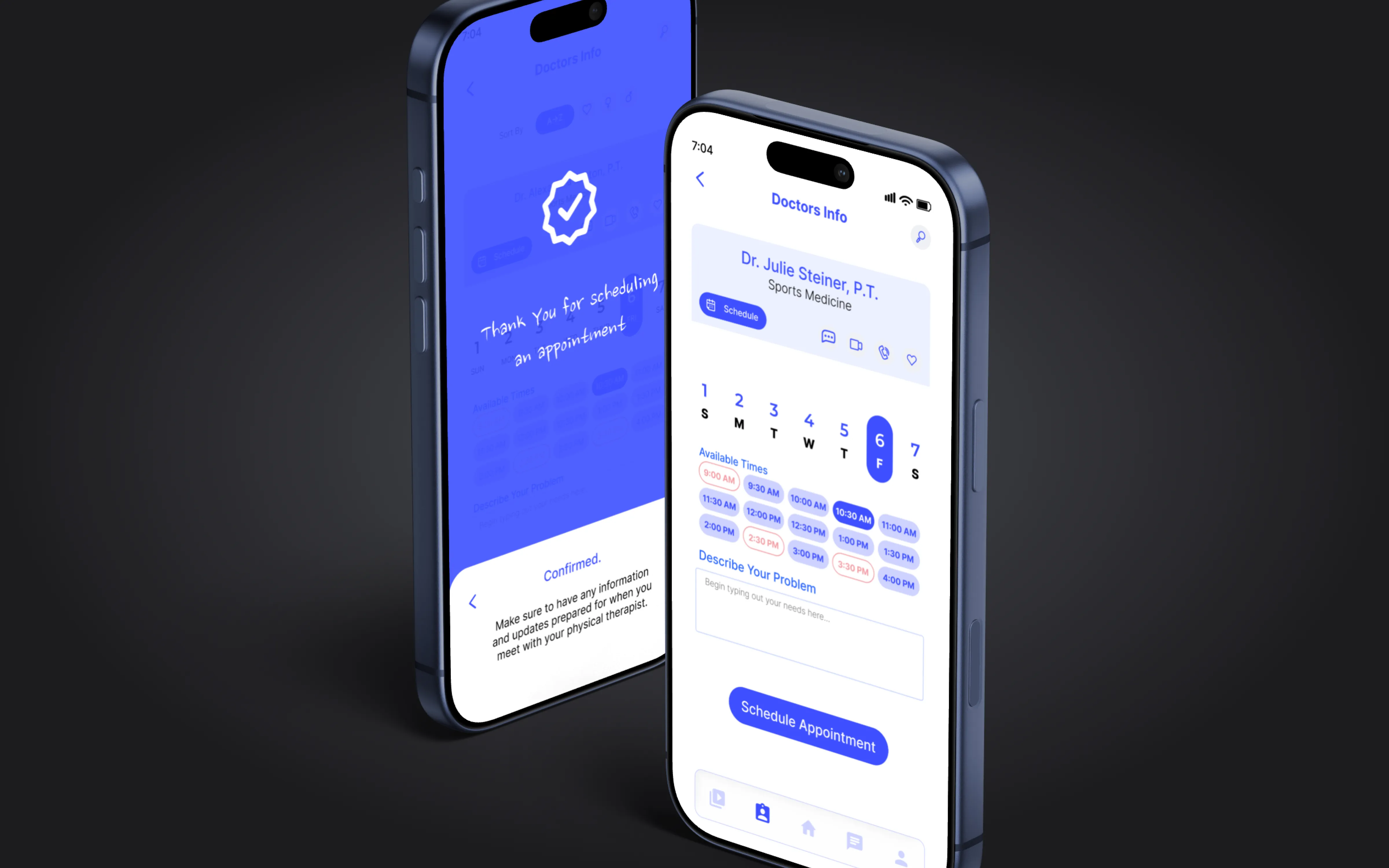
Appointment scheduling
App icon and dock
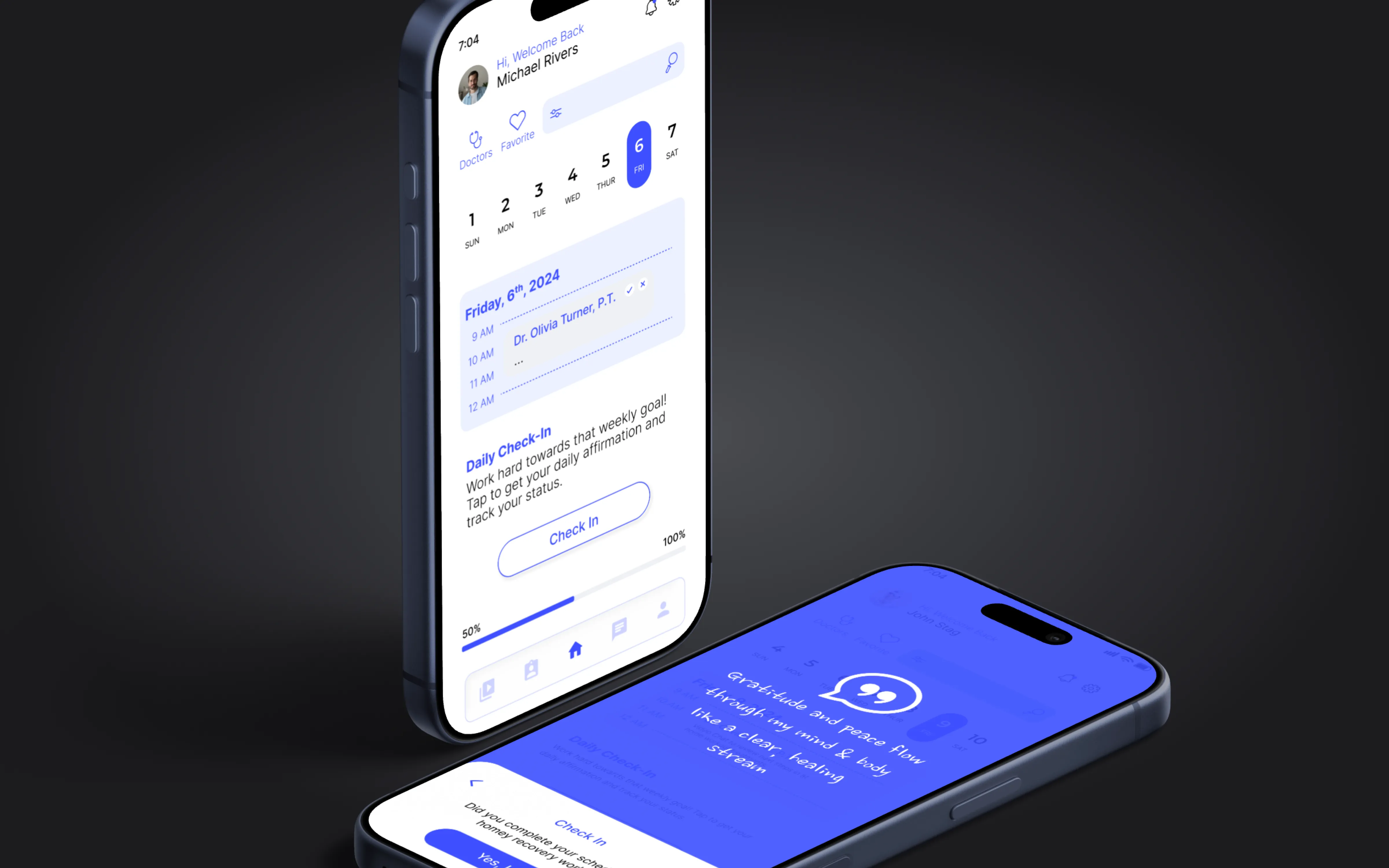
Daily check-in
Final mockups: scheduling, app presence, and daily check-in experience · Click to enlarge
10+
Patients and therapists interviewed. Research shaped every design decision.
80%
Found the app easier than paper sheets. Clarity beat complexity.
90%
Said they would be more likely to complete rehab exercises with this app.